Deborah Jean Nielsen
My client Deborah Jean Nielsen needed a branding & website rework and everything here shows the results of our collaborated efforts. I updated her branding to be more inline with her profession & personal philosophy and applied that amongst her website and marketing tools.
Branding Design

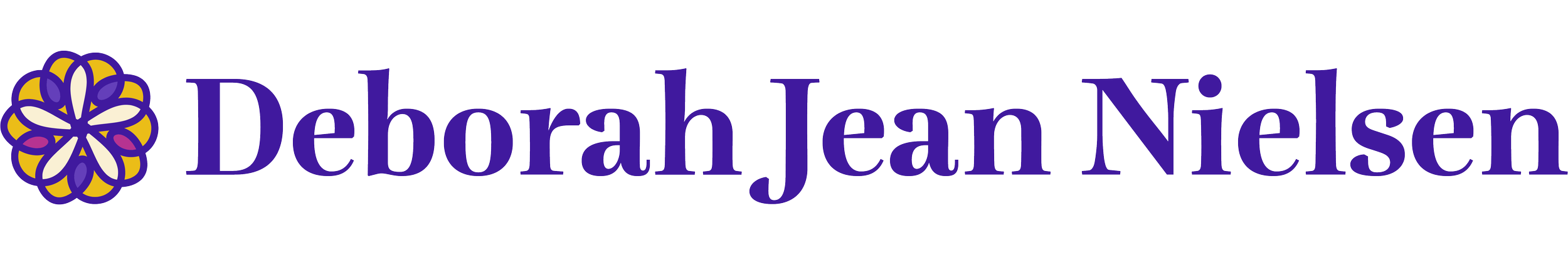
These logo & logotype designs were made creating the shape of a hand drawn heart. Using that shape, I multiplied and intersected 5 hearts to symbolize Deborah’s practice of focusing on emotion and the heart. As it intersects, it also creates a figure, which represents Deborah’s ideal of incorporating self in her life & work.
I chose Lavigne Display, a light serif font, to balance the geometric playfulness of the logo graphic and allow a professional touch.
All of these combined with the custom color palette of warm purples and yellows I created make a branding system that is inviting to new possible clients and existing ones that recognize Deborah’s philosophy.

Website Design
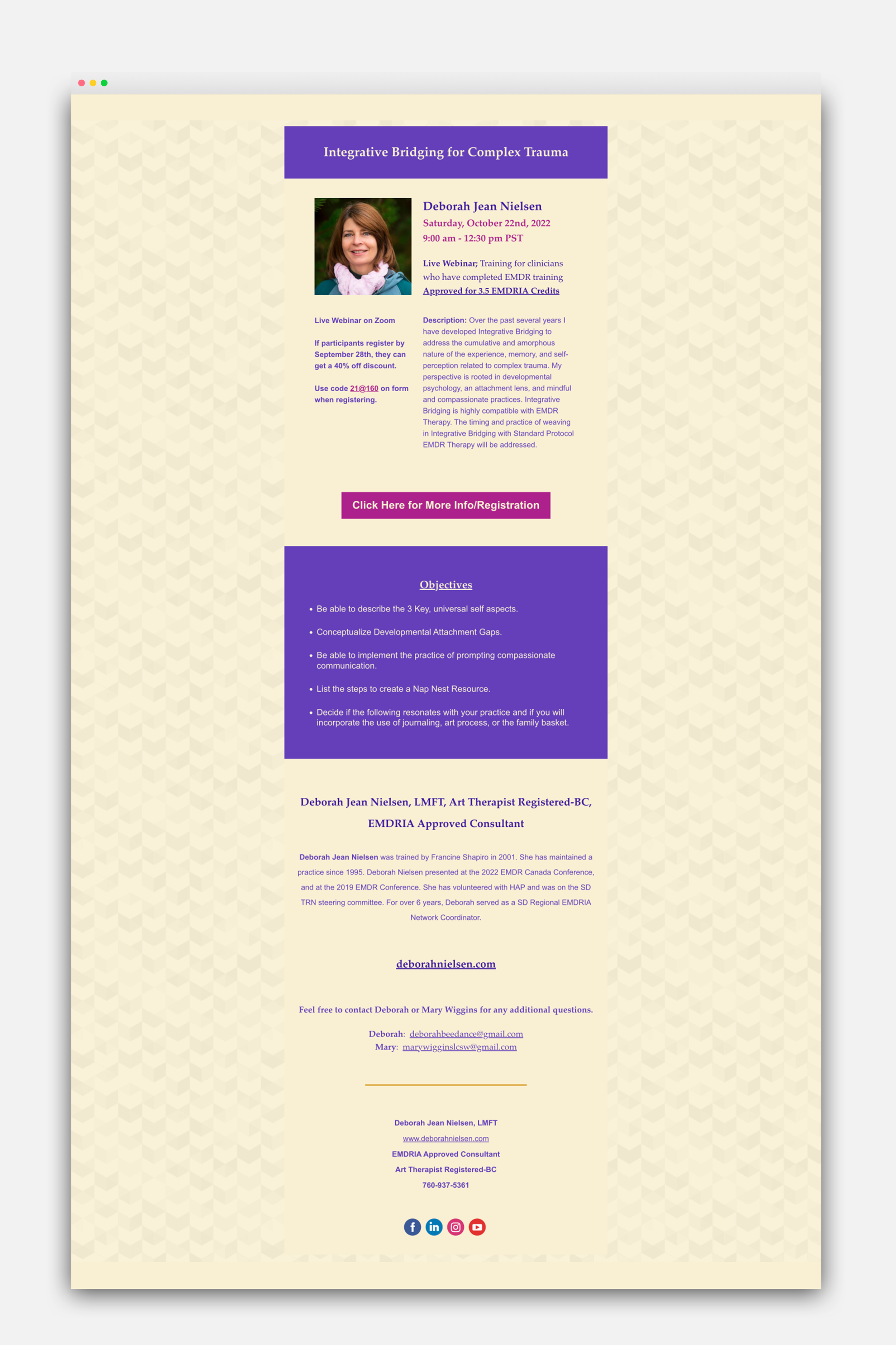
Email Design for Live Webinar