Hometown Marketplace
Below show the concepts and design process of the development of the app icon for a new mobile app: Hometown Marketplace. These concepts were developed over a short yet dedicated time period to ensure that they would make the app’s launch.
CONCEPT
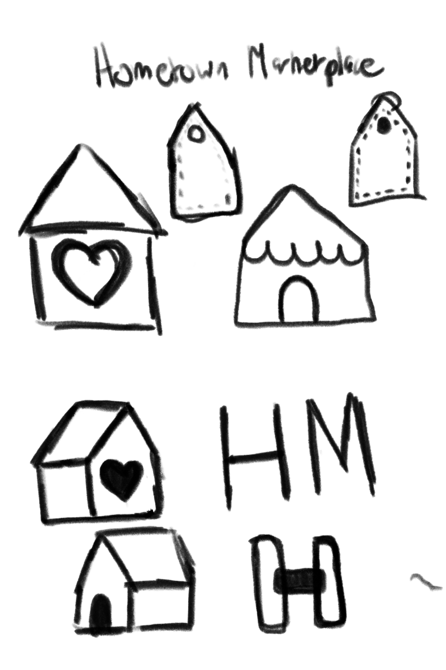
My client needed a logo for their new mobile app: Hometown Marketplace. This app would serve as a marketplace where buyers and sellers could connect with locals to build their brand and buy custom-made products.
With my concept art, I really wanted to hone in that this was a “neighborly” feeling space, which is why I drafted a few home icons. I also wanted to play with price-tags and the “H” and "M” as the first letters of the app, which is eventually the concept I continued with.
TYPE & LOGO MARKS
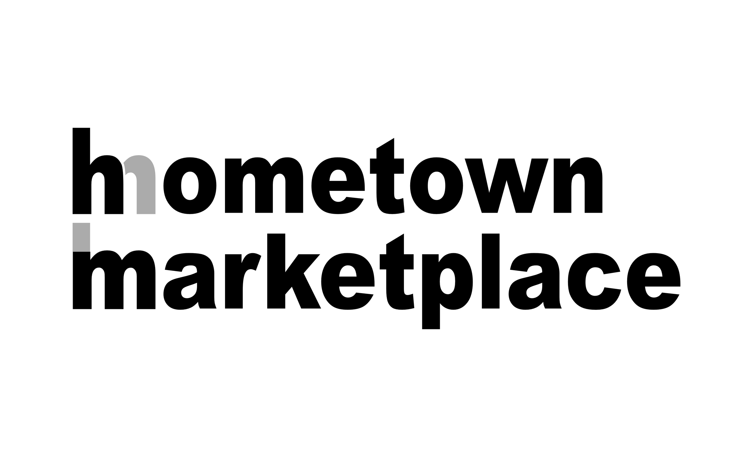
The typeface I chose for the brand was “Arial” in the “Black” font variant. I wanted a type that would be feel “homey” and comforting to look at, but still bold and visible enough to convey the statement of the marketplace side. This is also why I chose to display it in lowercase as it shows the relaxed and comforting nature of the app, similar to a farmers market.
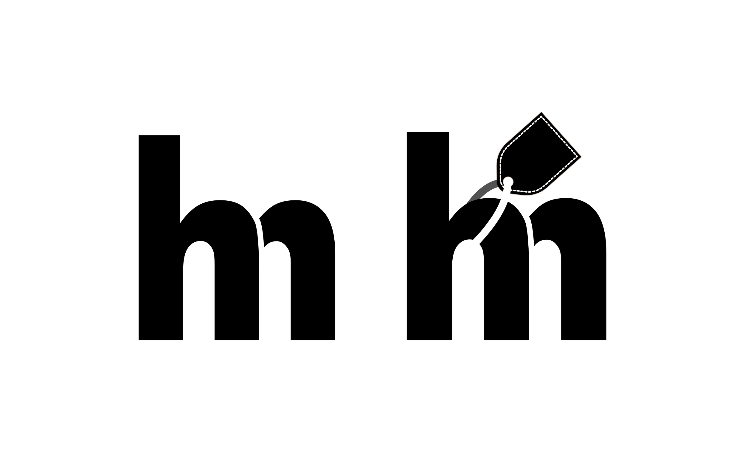
Using lowercase also brings out the similar structure the “h” & “m”, which I play into with the logo mark below.
This base allowed the development of the logo mark which would be the best way to display in a 1:1 app icon format. The logo mark highlights the similarity between the “h” & “m” and brings them together, showing the equal importance of the two-word brand name.
Bringing in the price tag from the concept art completes the brand image to emphasize the buyer/seller.
COLOR PALETTE


For the color palette, my client already had a primary pumpkin orange that they used in the app development process, and I wanted to follow this guide as I thought it best fit the “homey” feel I was going for with the app icon. I add a few more colors to compliment this, including a warm peach, chocolate brown, and an accent deep emerald green to use in the app to contrast the warm palette.
FINAL LOGO

Bringing all these elements together with the logo mark, I developed an app icon that emphasizes both sides of the brand: a homely feeling marketplace where locals can connect and create. Using the color palette also allowed me to add dimension to the right side “m” portion of the logo using a gradient of orange and brown.